New Brand: An evolution takes shape
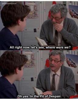
Well, hello there! We meet again. We're starting to feel like the grandpa in The Princess Bride, slowly telling our story.
Let's see, where were we? Ah yes, our brand research.
We spent months listening to our communities and reviewing research on our users. At the end of our research process, we took a step back and surveyed the landscape (get it?).
When taking a look at our current logo and visual identity, we realized it didn't represent the growth we've experienced as an agency or the adjusted brand strategy. So we decided it was time for a change.
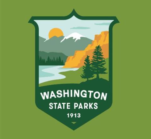
Creative Direction
The first part of our visual change was to take a look at our research. We knew that our logo needed to be based in the natural beauty of the state, encompass natural elements from all areas of the state, and relate to a wide variety of emotions our communities bring to our parks. We also wanted to maintain the shield/badge shape to allow our new identity to build upon our previous one.
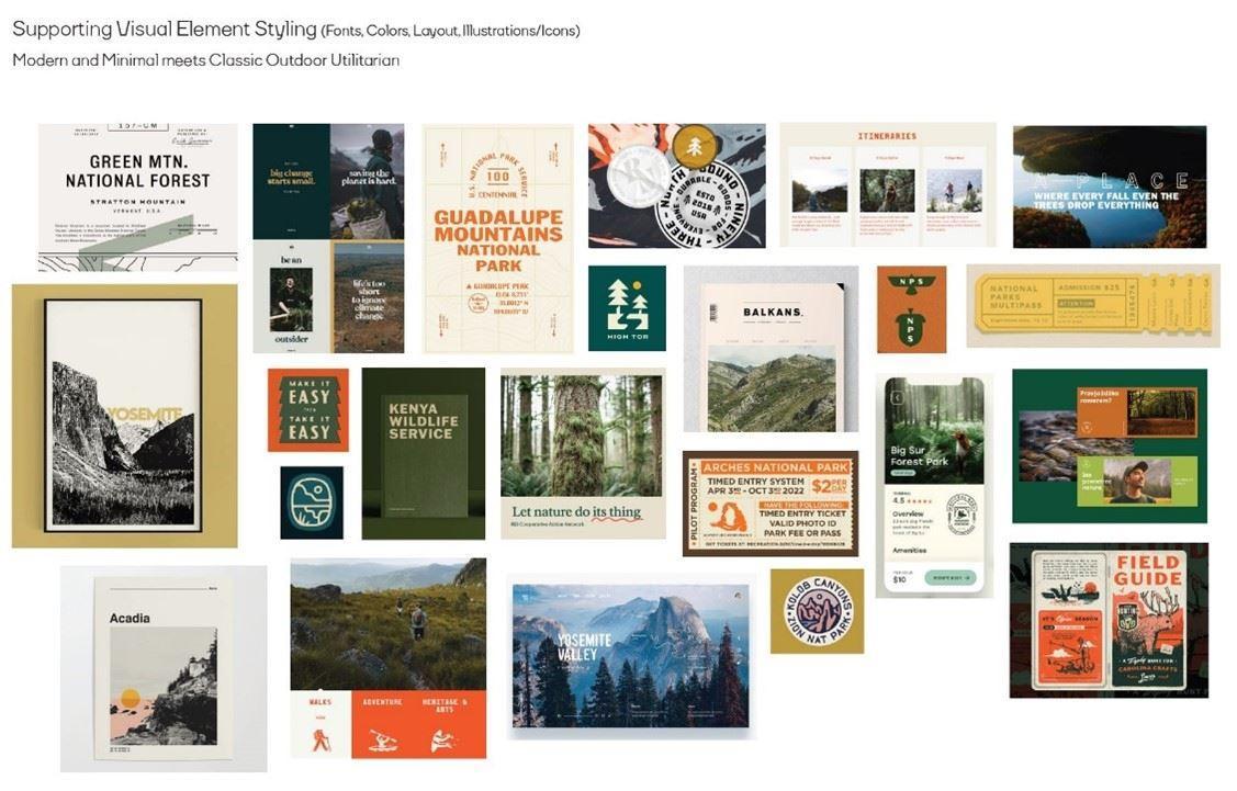
We worked closely with our design partner, People People, to establish a design direction. Our brand should be modern yet classic, timeless. Find a way to be exciting and welcoming at the same time; simultaneously offering adventure and inclusion. Our brand should NOT be too fussy or precious. Too hand drawn/cute, and not of a specific decade. We wanted our visual identity to feel like it can include everyone, and not allude to a bygone era where everyone was NOT included.
Overall Inspiration: Modern minimal meets classic outdoor utilitarian
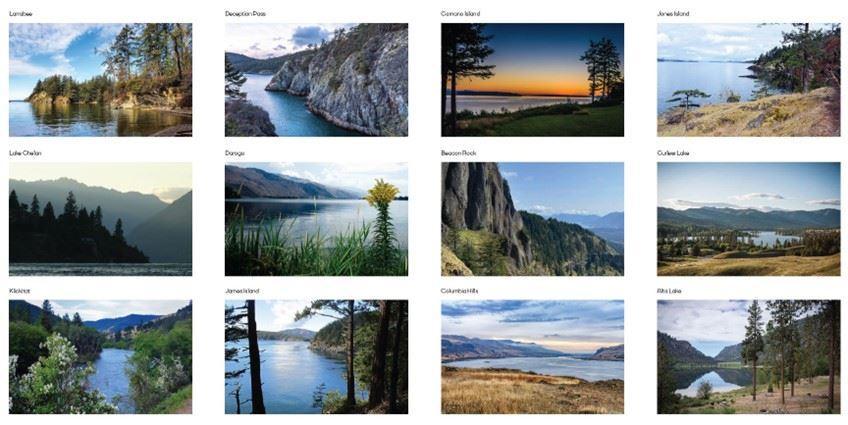
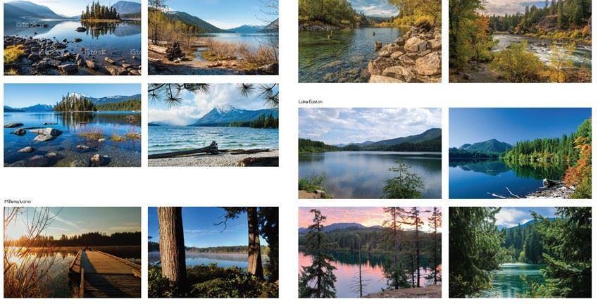
Primary Logo: Landscape Inspiration
We knew it was important to take inspiration from parks across the state. Our research also told us that water and trees were important natural elements to include in any designs.
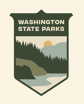
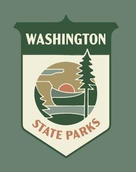
Round 1 Logos
This round of logos was exploratory for our design partner using the design direction and communicating landforms representative of the entire state.
Round 2 Logos
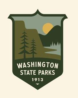
Our feedback from Round 1 was that we needed some brighter color palettes and more definition of landforms. Round 1 came across as a bit simple and our design partner added additional texture and detail to the landforms in this round.
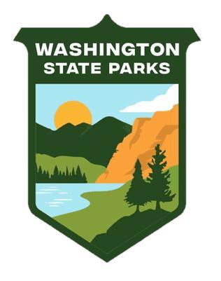
Round 3 Logos
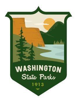
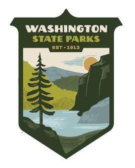
Round 2 logos incorporated a brighter palette and more definition. We had conversations here about how much detail/texture to include and the style of the detail (clean vs. a slightly hand-drawn or woodcut). We asked for color adjustments and streamlined down to 2 options. Round 3 is where we really had hard conversations around color -- brighter or more subdued.
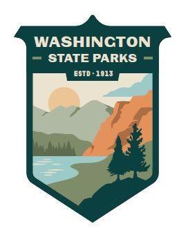
Final Round
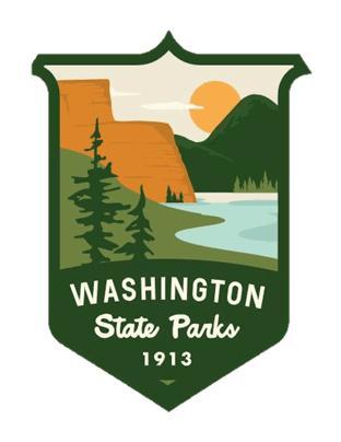
And here we arrive at our new adjusted logo. After multiple rounds and hours of discussion, our creative process arrived at an engaging logo that will be flexible enough to grow with the agency and remain relevant for decades into the future.
Originally published February 08, 2022

